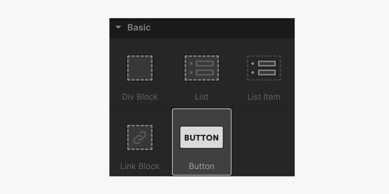
Button icon thumbnail

1. ボタンの追加をする方法

‍ボタンは、‍追加パネル(A)>要素タブ>基本セクションから追加することができます。ボタンのテキストを編集するには、ボタンをダブルクリックするか、ボタンを選択してEnterキーを押します。

The five elements that are included in the Basic section are div block, list, list item, link block and button (highlighted.)

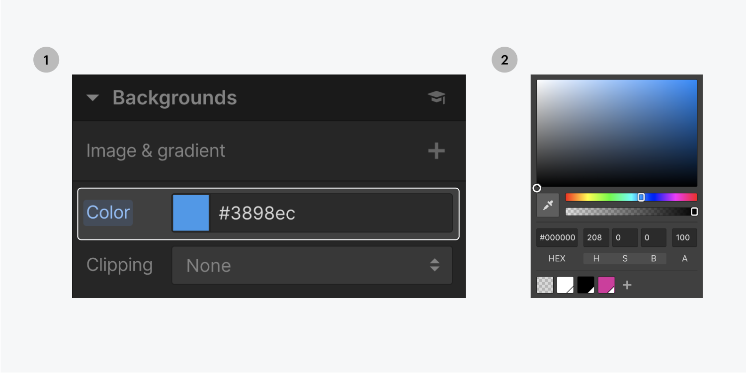
背景色を追加するには、右側のスタイルパネルをクリックし、「背景」までスクロールし、カラーピッカーから色を選択します。

Step one on the left, select the background color thumbnail. Step two on the right, select your preferred color in the color picker panel.

‍ボタンのフォントとすべてのタイポグラフィースタイルは、「Body(All Pages)」タグから継承されます。変更するには、スタイルパネルのBody (All Pages)タグに入り、タイポグラフィのデフォルトを設定し、上書きしてください。

Step one, select the Inheriting selectors. Step two, select the Body (All Pages) from the Inheritance dropdown menu.

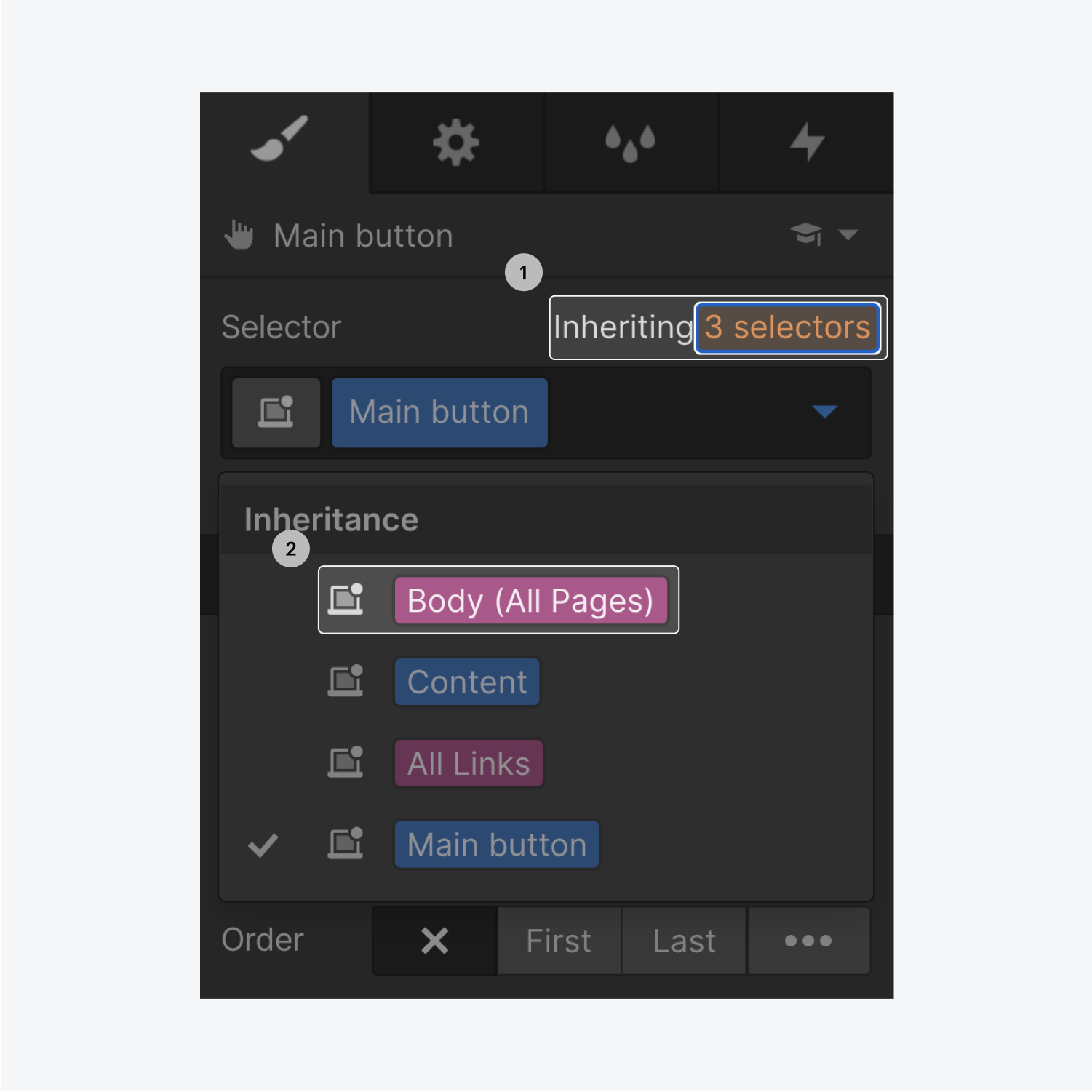
‍新しい要素に変更を加えると、自動的にクラスが作成されます。クラスによって、スタイルの制御やデフォルトの一部変更が可能になります。スタイルを再利用するには、クラスラベルをクリックし、名前を変更します。

Step one on the left, click on the class name "Button." Step two on the right, rename class to "Main Button."

2. ボタンの大きさを設定する

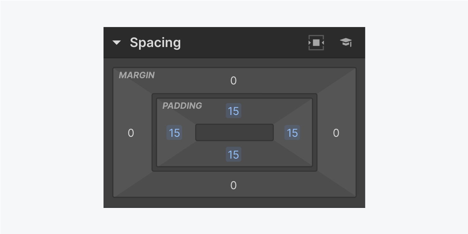
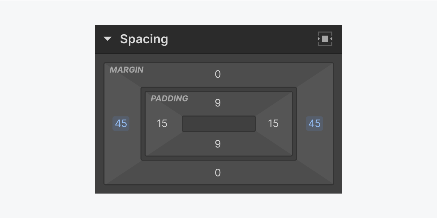
ボタンの大きさは、中のテキスト(テキストの長さ、フォントサイズ、行の高さ)とパディング(ボタンの中の空間)によって決まります。

‍ パディングのデフォルト値を上書きするには、スタイルパネルの「スペーシング」>「パディング」で、Option(Mac)またはAlt(Windows)を押したまま、カーソルをクリック&ドラッグしてください。これにより、両方のパディング値が一度に調整されます(側面または上面と下面のどちらか)。

The spacing panel displays 15 pixels of padding on all four sides, and no margin added.

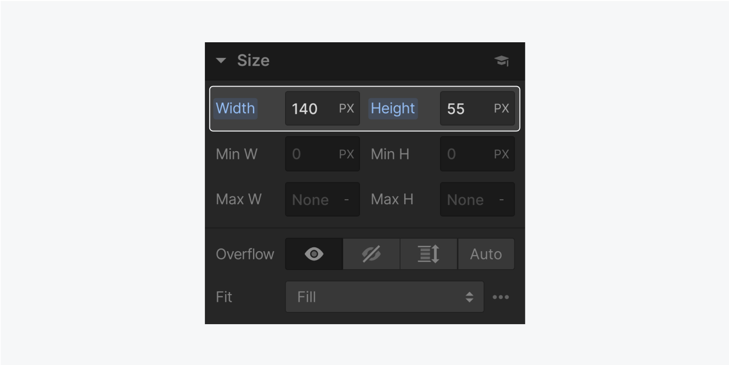
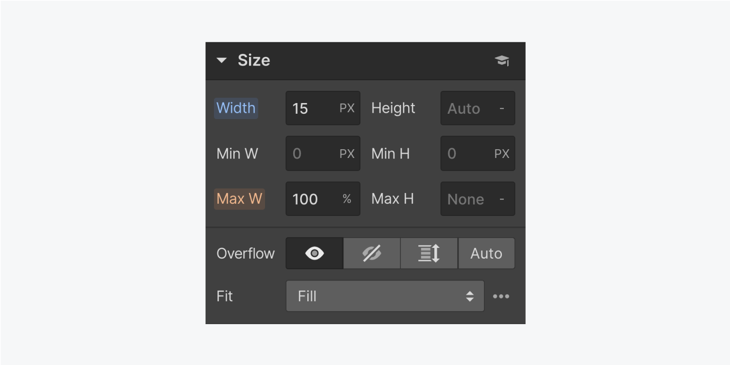
ボタンの大きさは、スタイルパネルの「サイズ」で「幅」と「高さ」を変更することで調整できます。
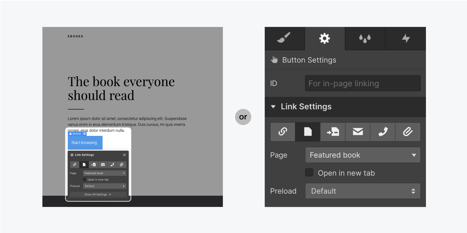
The size panel displays a width of 140 pixels and a height of 55 pixels. This area is highlighted on the panel.

3. ボタンのリンク先を設定する

ボタンは、URL、内部または外部ページ、ページセクション、ファイルのダウンロードにリンクすることができ、また、電子メールや電話を起動させることもできます。

The link settings panel displays six link button types, a dropdown for Page, a check box for "open in new tab", a dropdown menu for Preload and a show all settings button. The Page link button is selected.

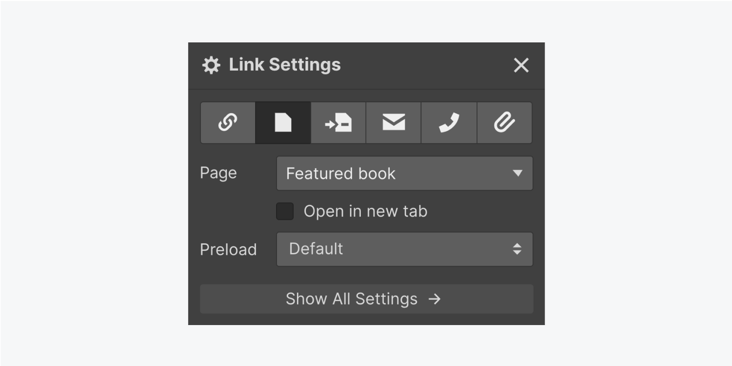
‍キャンバス内のボタン要素にある歯車のアイコンをクリックするか、右側の設定パネルを開いてボタンの設定を調整することができます。
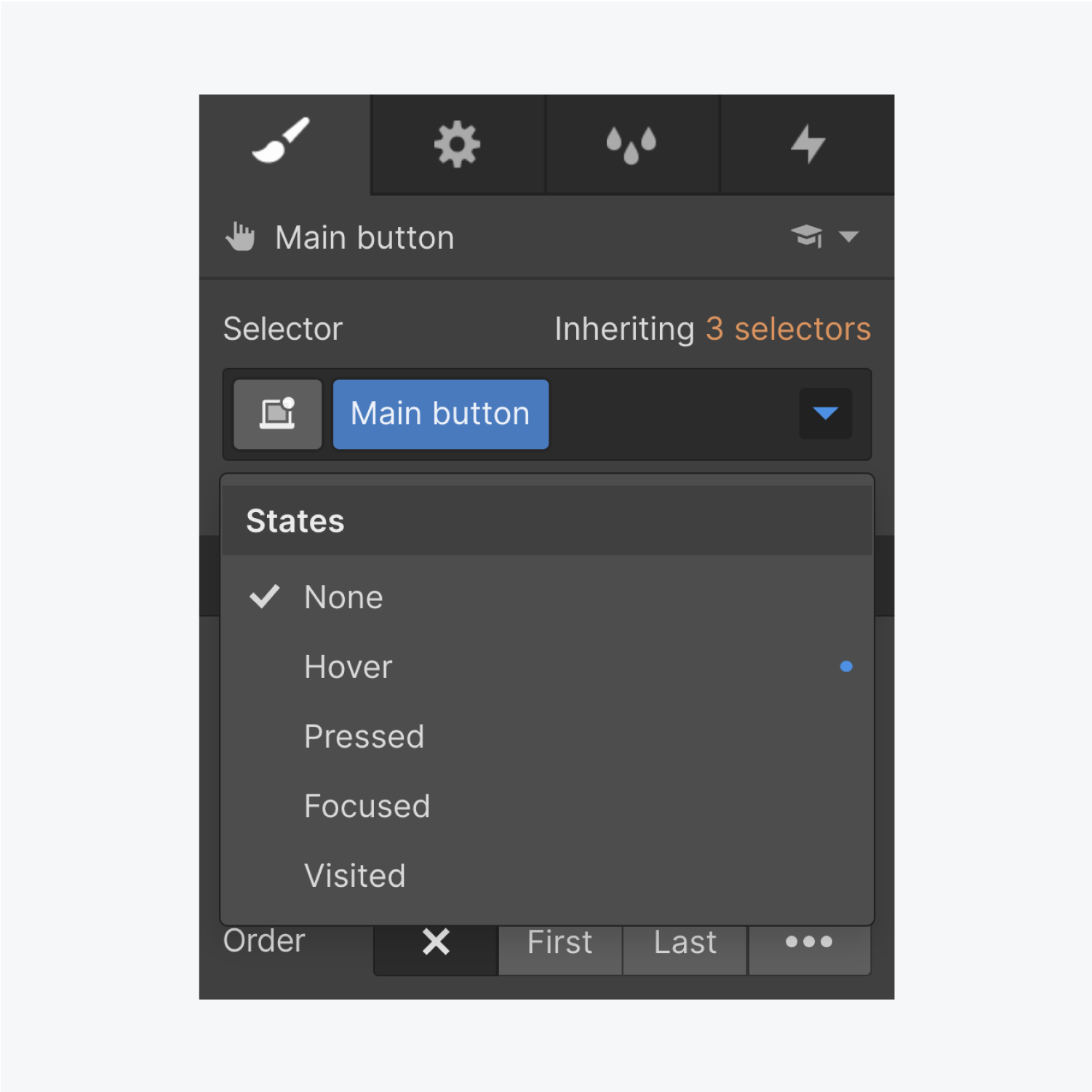
On the left, the cog icon is clicked and the link settings panel is open. On the right, the link settings are open in the element settings panel on the right of the designer.

4. ボタンのスタイルを設定する

スタイルパネルのセレクタフィールドをクリックすると、すべてのボタンステートが表示されます。デフォルトでは、ボタンにホバースタイリングはありません。ドロップダウンリストのHover(ホバー)状態をクリックすると、ボタンにカーソルを置いたときにどのように見えるかを変更することができます。
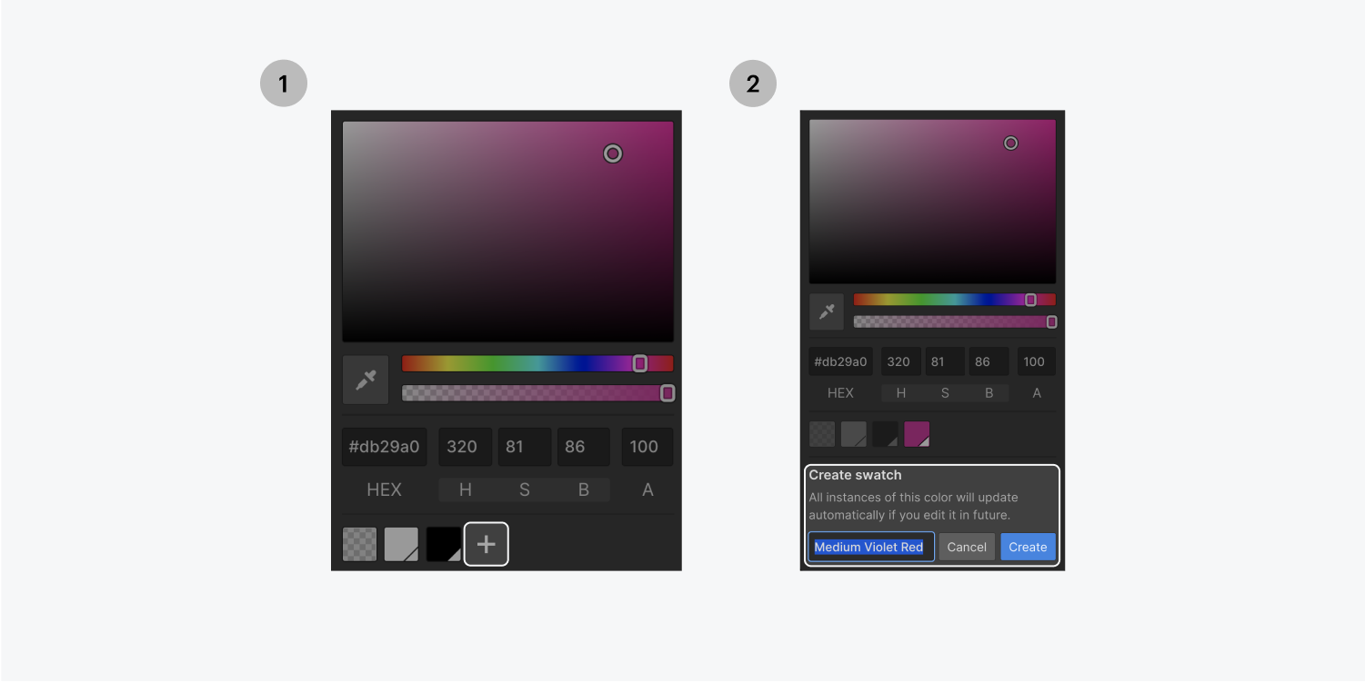
The selector dropdown menu displays five states, none, hover, pressed, focused and visited. None is currently selected.

ホバー時の背景色を変えたいとき

ここでは、ホバー時に変化する背景色を設定することもできます。選択した色をグローバルスウォッチとして追加すると、プロジェクト全体で再利用することができます。

Step one on the left, click on the plus sign (highlighted) to add swatch as a global swatch. Step two on the right, name new global swatch and click create (highlighted).

‍ホバー時にボタンを動かしたいとき

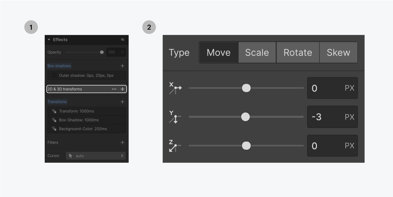
ホバー時に他のスタイルを設定するには、「効果」の下にある、変形を追加するなどの方法があります。例えば「移動」を選択すると、ホバー時にボタンが移動するようになります。

ボタンの角を丸くしたいとき

他のボタンのプロパティで遊ぶには、セレクタに戻ったドロップダウンメニューで、ホバー状態から「なし」に切り替えます。Bordersセクションの「Radius(半径)」を変更することで、角を丸くしたりすることができます。
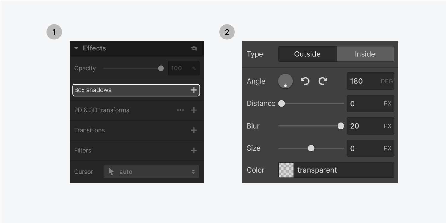
ボタンに影を追加したいとき

ボタンに影を追加するには、スタイルパネルの[効果]セクションで[ボックスシャドウ]の隣にあるプラス記号をクリックし、設定を行います(たとえば、[ぼかし]を20pxに設定して柔らかくし、[角度]を180に設定します)。

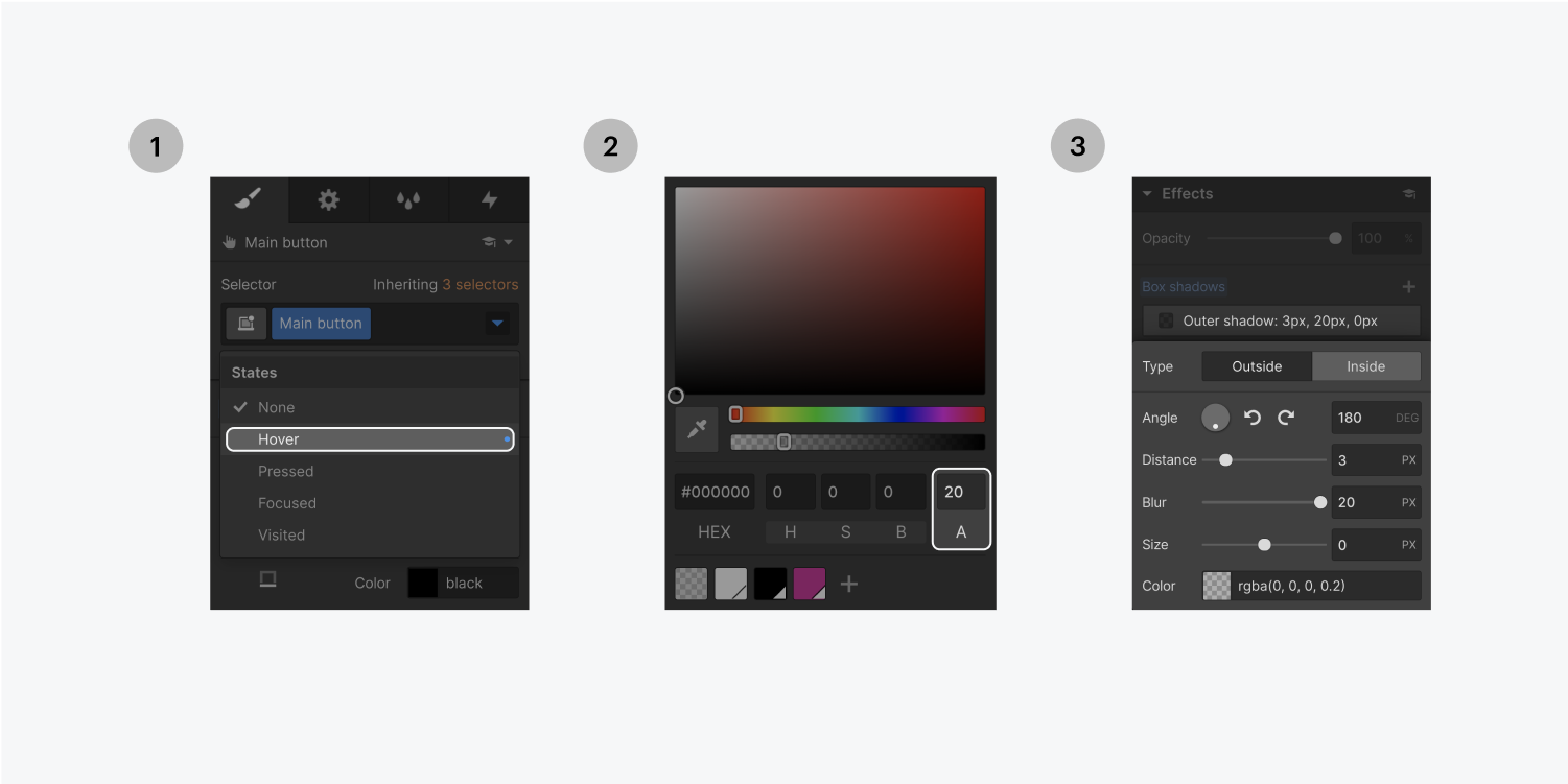
これはホバー状態ではないので、[距離] と [色] の不透明度を 0 に設定できます。後でボックスシャドウを追加してこれらの値を相殺し、ホバー効果をより劇的な変化にします。

Step one on the left, click the plus sign on the box shadows effect. Step two on the right, customize the shadow with type, angle, distance, blur, size and color.

‍ クリックしてホバー状態に戻ると、先ほど作成したのと同じシャドウを修正できます(ホバー時に変化するように微調整する)。不透明度を上げたり(例:不透明度を20%にする)、距離を変えたり(例:3pxにする)することができます。

Step one on the left, select the Hover state from the selector states dropdown menu. Step two in the middle, enter 20 in the Alpha text input field. Step three on the right, customize the box shadow type, angle, distance, blur, size and color.

5. アニメーション効果をつける

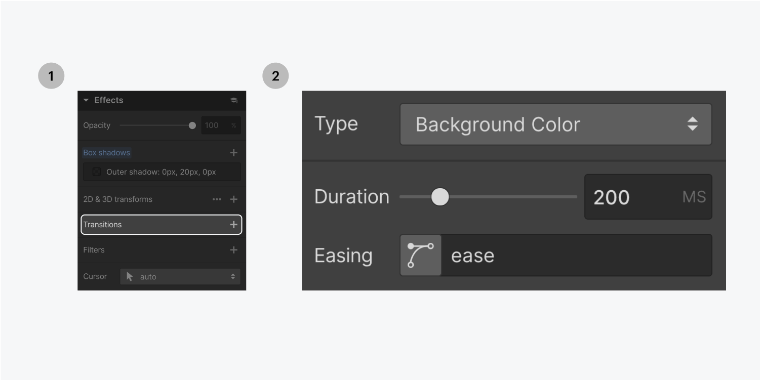
アニメーションを付けると、通常の状態と「ホバー」状態の間をよりスムーズに繋いで移動させることができます。トランジションを追加するには、「スタイル」パネルで「なし」状態になっていることを確認します(トランジションは常に「なし」状態から追加してください)。

「効果」セクションで、「トランジション」の隣にあるプラス記号をクリックします。「タイプ」の隣にあるメニューをクリックし、「背景色」を選択します。デフォルトの期間は200に設定されており、これは200ミリ秒かけて遷移することを意味します。ボタンの上にカーソルを置いて、試してみてください。

Step one on the left, click the plus sign next to the Transitions effect. Step two on the right, customize the transition type, duration and easing.

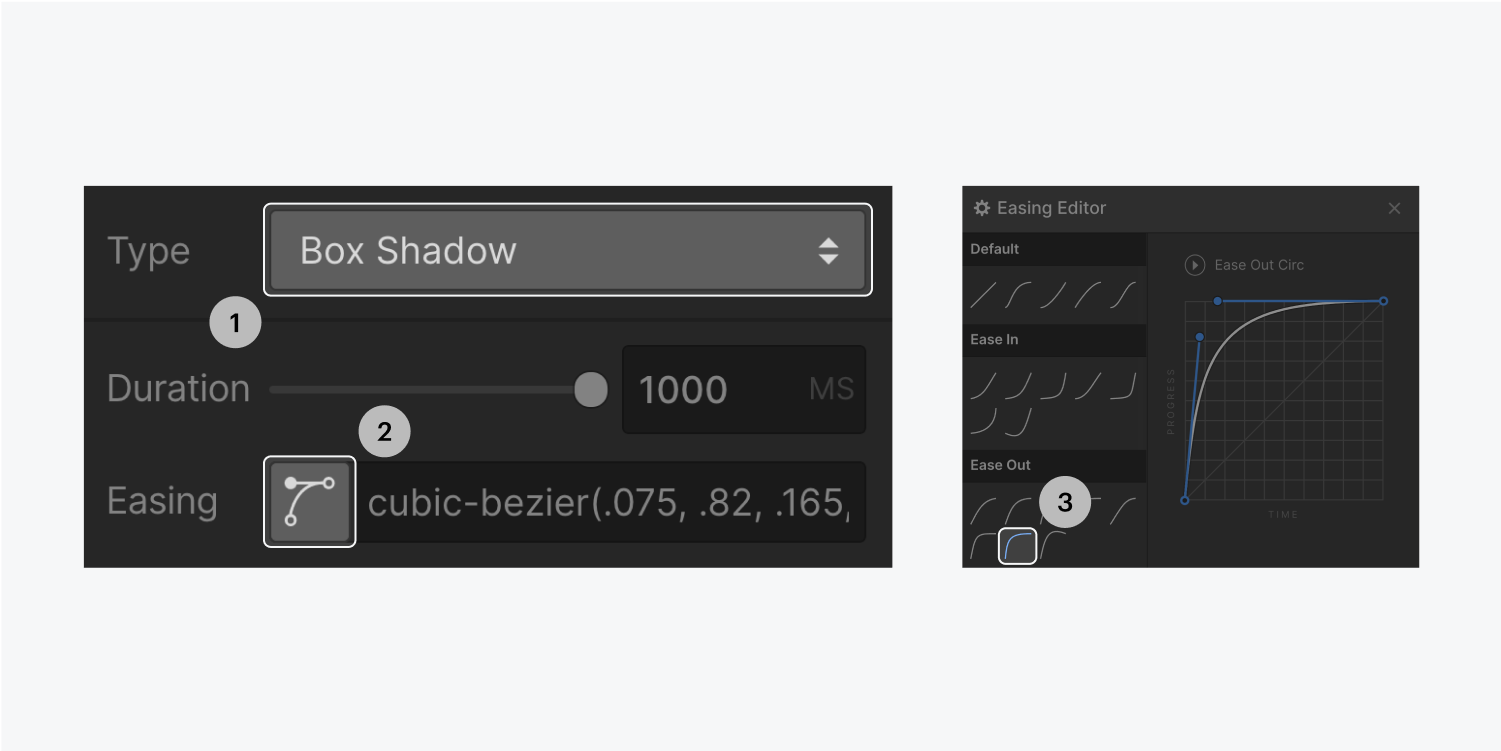
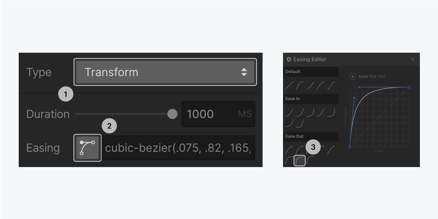
影をアニメーション化するには、Box shadowプロパティにトランジションを適用し、イージングカーブを変更します。デフォルトは「ease」ですが、より劇的な開始と緩やかな終了を試すことができます(「ease out circular」がよい選択です)。開始が劇的なので、タイミングを1000MSまで拡大するとよいでしょう。

Step one and two on the left, select box shadow from the Type dropdown menu and click the easing button. Step three on the right, select the ease out circular button under the East Out section.

カーソルを合わせるとプレビューができます。

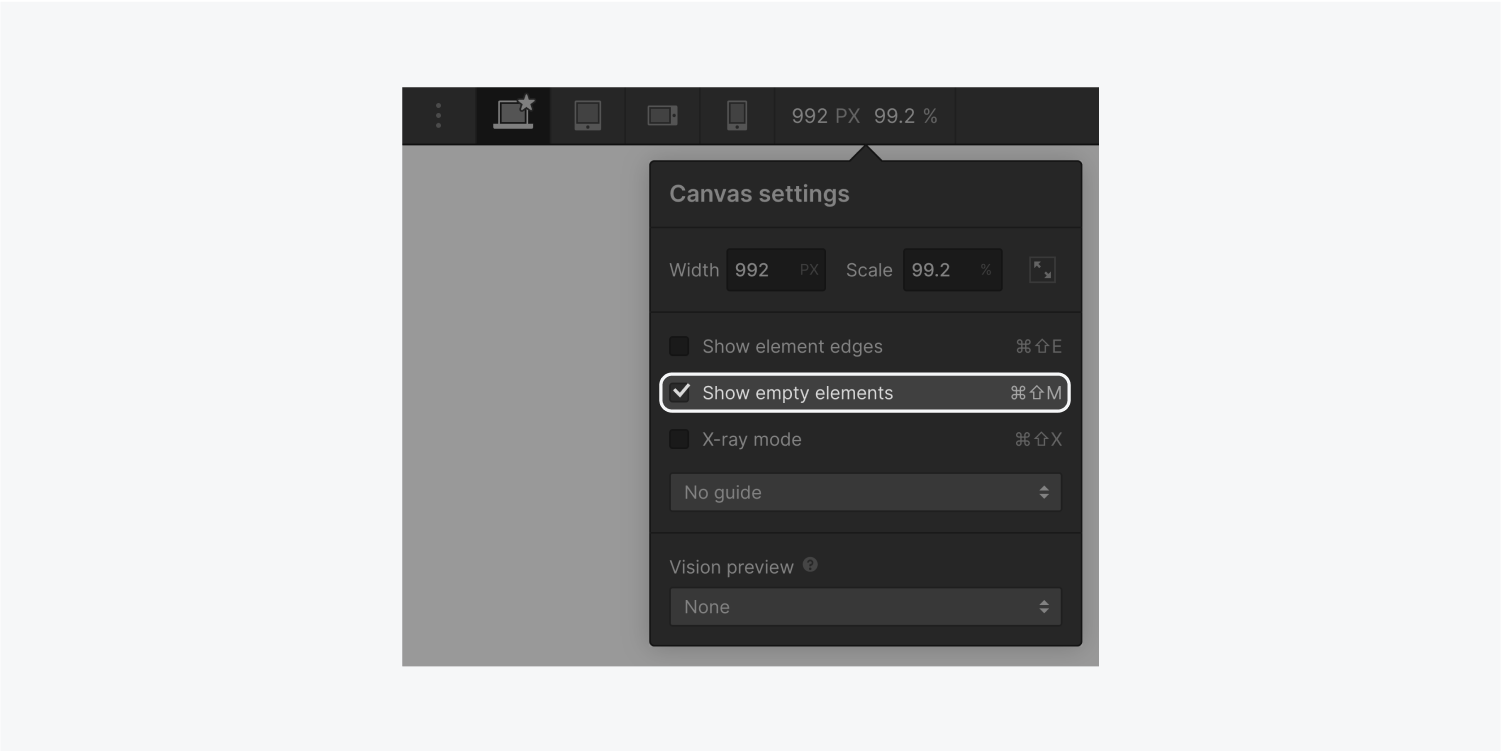
要素の選択を解除するには、いつでもEscape(MacとWindowsの場合)を押すことができますが、要素の境界線(ホバーしてテストするときに青い輪郭)が邪魔になる場合があります。ブレークポイントのアイコンの横には、「要素のエッジを隠す」を選択することができます。

The Canvas settings panel displays a width text input field, scale text input field, a check box for show element edges (highlighted), show empty elements, x-ray mode and a dropdown for guidelines. It also displays a Vision preview section with a dropdown menu.

ホバー時にボタンを移動するには、スタイルパネルのセレクタでホバー状態に戻り、エフェクトセクションで、2D & 3D Transforms の隣にあるプラス記号をクリックします。移動の値を追加します (例: 3PX up)。

Step one on the left, click the plus sign for 2D & 3D transforms. Step two on the right, customize the effects Move setting to -3 px using the slider button or input the characters in the text input field.

また、トランスフォームのトランジションを追加することもできます。ボタンの「なし」状態に戻ります。効果」セクションまでスクロールし、再び「変形」の隣にあるプラス記号をクリックします。タイプ」の隣にあるメニューから「トランスフォーム」を選択し、「イージング」(例:「イージングアウトサーキュラー」)と「デュレーション」(例:「1000MS」)を変更します。

Step one and two on the left, select transform from the Type dropdown menu and click the easing button. Step three on the right, select the ease out circular button under the East Out section.

‍プレビューモードで作品を確認してみましょう。

The blue preview mode icon is highlighted next to the Page name.

6. 複数のボタンを並べる

複数のボタンを隣り合わせに配置するには、最初のボタンをコピーして貼り付けます。Altキーを押しながらマージン矢印をドラッグすると、ボタンの両側にスペースができ、中央に整列した状態に保たれます。そのクラスのボタンに加えたスタイルの変更は、そのクラスのすべてのボタンに影響することを忘れないでください。

The spacing settings panel displays a margin of 45 pixels on both the left and right sides.

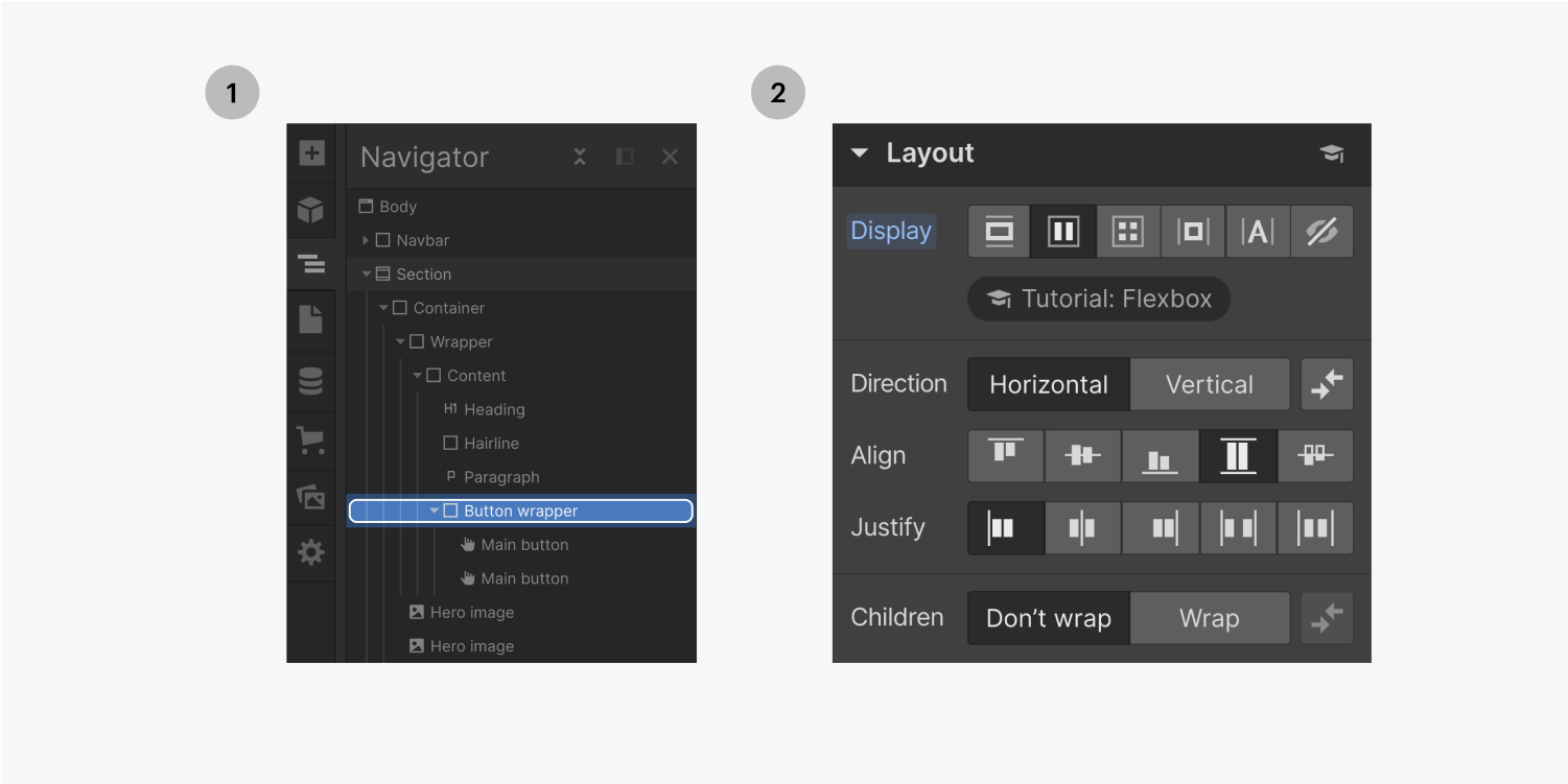
‍ヒーローセクションのボタンに特別なクラスを追加する代わりに、divブロックを追加して、それに名前を付け(例:Button wrapper)、各ボタンをその中にドラッグすることができます。これにより、1つのボタンクラスを管理し、完璧な位置合わせのために負のマージンを設定することができます。

Div block icon thumbnail

この機能はあらゆるものに有効です。ボタンに設定した対称的なマージンを相殺するために、ボタンラッパー(負のマージンを持つ)をどこでも使用することができます。ボタンの配置が異なるだけで、異なるグループのボタンを管理する必要がなくなります。

Step one on the left, click and drag the link block icon onto your canvas. Step two on the right, name the elements’ class in the selector.

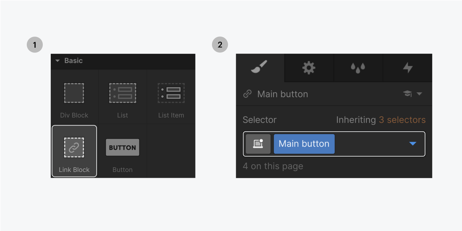
‍タイポグラフィー」の「追加」パネルから、「リンク」ブロックの内側のキャンバス上に「テキスト」ブロックをドラッグし、ダブルクリックしてテキストを編集します。下線を消すには、「スタイル」パネルの「タイポグラフィ」セクションで、「スタイル」の隣にある「X」をクリックします。この同じパネルでリンクの色を変更することができます。

On the left, the typography section from the Add panel displays six elements. The elements are heading, paragraph, text link, text block, block quote and rich text. On the right, the typography style settings displays the decoration area (highlighted).

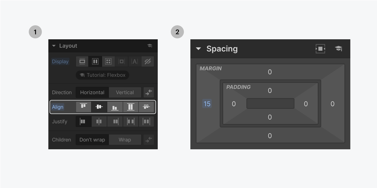
リンクブロックの中でドラッグすることで、アイコン(矢印など)を追加することができます。アイコンのサイズを変更するためにコーナーをクリックしてドラッグする代わりに、スタイルパネルを使って値を入力すると、自動的に作成されるクラスによって、プロジェクト全体でこのリンクブロックを再利用するたびに、矢印のサイズを変更することができます。

The size settings panel displays text input fields for width, height, minimum width, minimum height, max width and max height. It also displays the four Overflow buttons, visible, hidden, scroll and auto. There is a dropdown menu for Fit settings.

‍アイコンをボタン内に配置するには、スタイルパネルの「レイアウト」で設定を変更し(例:表示:中央、整列:中央)、「スペーシング」で余白を調整します。

Step one on the left, the layout section of the style panel displays the five align styles highlighted. The center align is selected. Step two on the right, displays a margin of 15 in the spacing section of the style panel.

‍また、Mainボタンクラスにフレックスを追加したため、上部の2つのボタンがButtonラッパーdivブロックの幅を完全に占めてしまいます。これを修正するには、ナビゲーターでボタンラッパーを選択し、スタイルパネルのレイアウトで、表示を中央に設定します。

Step one on the left, select the Button wrapper element. Step two on the right, on the layout section of the style panel select the center setting for Display.